0
Pro-craft-ination
Alright. I know what you're thinking..."So much for starting that blog and all those projects...they haven't even posted house pictures yet!" Truth be told, our house has pretty much been a complete mess since we moved in and we just haven't had the time to clean it and take nice pictures to show all of you. You know, the ones where our house will look all well put together clean and sort of organized, to make you think that's what it looks like every day. Well that's not what it looks like every day, and half our stuff still isn't in a permanent place, which is exactly why the pictures don't exist yet.
Psych! Not our wedding (you would obviously know about that in advance). Darren's sister, Rachel's wedding! She and herfiance husband got married at Mayfield Country Club this past Saturday. A little background note...When Darren's other sister, Jamie, got married last year, I offered to make all of her escort cards, programs and table numbers as her wedding gift. Rachel liked the idea and asked if I would be willing to do the same for her - which of course, I was. Needless to say, I've had ribbon, paper, and all the other supplies laying all over my living room for the past couple weeks.
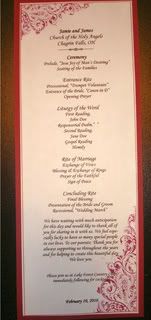
These were definitely not the final products, as you can tell by the inaccurate information on the program. Plus, I ended up color matching the graphics to the paper (using a Panatone color selector in Microsoft Publisher) and making some other alignment edits, etc for the end results. But these at least give you an idea. The escort cards followed a similar theme.
To make the program, I had created my own template in Microsoft Publisher with dimensions of 4.25"x11" (exact dimensions of a half sheet of regular paper) for Jamie's programs, so I reused that same template to make Rachel's. Each half sheet is considered a 'page,' so I just created two pages (the front and back of the program) and then printed them out double sided on 110lb weight paper, which is a very thick card stock. Since I wanted some fancier font options than what my Mac comes with, I browsed on over to DaFont.com for some sweet free fonts. The script font on the program (as well as the escort frames and table numbers) is called 'Brock Script' and the front graphic is part of a font series called 'Damask Dings.' I just picked a damask image I liked best, super-sized the font in it's own text box, and aligned it with the rest of the text. Ta da! Pretty design. Oh, and the fancy little 'knot' at the top? Here's a quickie on how I did it:
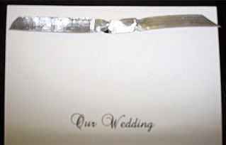
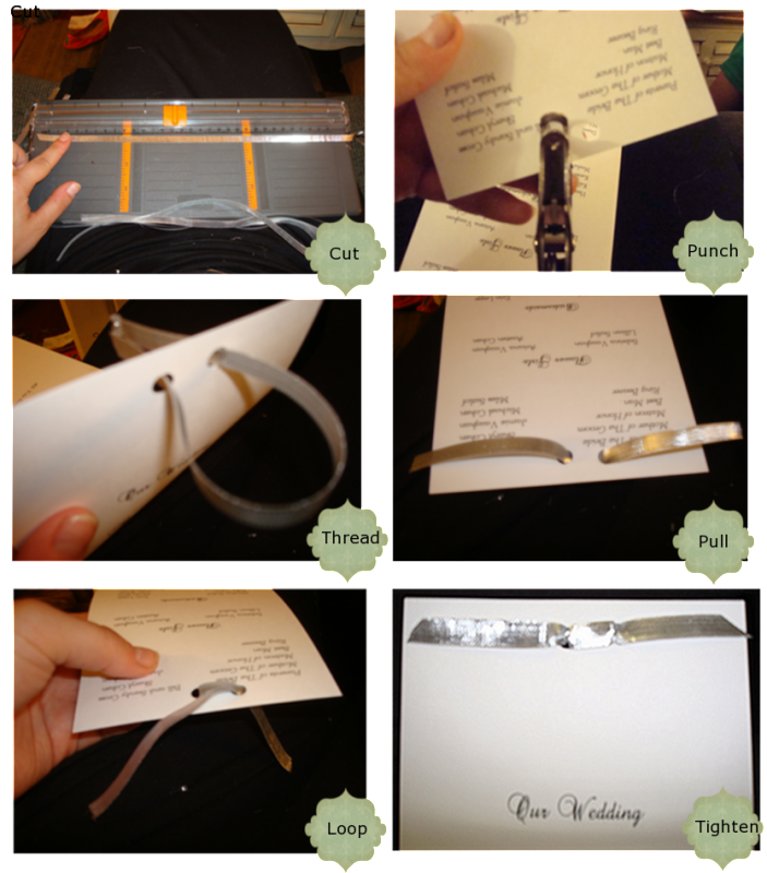
First, I cut pieces of silver ribbon 12" long. Then I punched two holes centered in the top of each program. Starting at the front of the program, I threaded each end of the ribbon through a hole so they would hang out the back of the program. I pulled both ends through, evenly, so the ribbon would be flat up against the front of the program. With the ribbon tails facing upward, I crossed them in an 'X-like loop and inserted them into the opposite holes, pulling them through the front. All that's was left was to tighten the ribbon so it would lay flat on the front, and trim the ends for a nice clean angle. Easy peasy.
For the escort frames, I just made a spreadsheet of all the guest names, sorted them in alphabetical order (to make it easy on myself when I had to display them) and did a mail merge into a 2"x4" label template, which was close to the actual size of the frames. Then it was as simple as printing them on regular paper and cutting them. (Sidenote: The bolder serif font I used is called 'Copperplate.') Rachel bought the frames and dropped them off for me to 'stuff,' so I'm not entirely sure where she ordered them from.
Finally, for the table numbers, I used the same template as the program (since the table number cards were just half sheets of paper folded in half to make 'tents'). Then I made separate text boxes for the number and the word in the lower half of the template. This made it easier to align them properly. I grouped them together so they would be one image, then made a copy of the whole thing and rotated it upside down positioned in the upper part of the page. This resulted in mirror image numbers. When I printed everything out, all I had to do was cut and fold in half to make little self-standing table number 'tents' which could be seen from both sides of the tables. Done and done.
Ok, so this is more than you ever wanted to know about DIY wedding stationary - and probably not even useful to most of you - but it's what has been keeping me busy. And maybe now youenthusiastically know how to tie a fancy ribbon knot. Ok, maybe wishful thinking.
Sidenote: I also hemmed Darren's nieces' flower girl dresses. I won't go into detail, but let's just say I started with this...
Did a little of this...
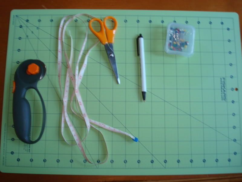
While we have already worked on a few projects to share with you - coming soon in future posts! (for real this time) - part of the reason we haven't gotten around to pictures is because I have had craft stuff all over our living room slash house. And this is why:
Psych! Not our wedding (you would obviously know about that in advance). Darren's sister, Rachel's wedding! She and her
Now, being a 'seasoned' DIY wedding crafter...and by seasoned, I mean 'I did this once before for Jamie, my mom is a wedding planner, and I pretend to know how to do stuff'...I already had some knowledge about the amount of time it would take and the cost of supplies that would be necessary for this undertaking. Rachel liked the style of program and escort cards I did for Jamie, which worked wonderfully because I had saved the templates from last time. (You know, always thinking ahead.) I don't know why I never took pictures of the final products, but here are some terrible pictures I found of the samples she ended up going with.
These were definitely not the final products, as you can tell by the inaccurate information on the program. Plus, I ended up color matching the graphics to the paper (using a Panatone color selector in Microsoft Publisher) and making some other alignment edits, etc for the end results. But these at least give you an idea. The escort cards followed a similar theme.
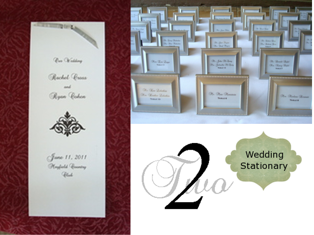
Rachel, on the other hand, wanted something more simple but just as elegant for her reception 'stationary.' Her wedding colors were black, white, and silver and she didn't want anything too graphic-heavy. In fact, she originally wasn't going to do a program, but based off interest from her and Ryan's moms, she decided to go with something very basic. For the escort cards, she decided to do a combo favor/card by using mini picture frames she found online, which meant easy work for me. Here's how everything turned out:
To make the program, I had created my own template in Microsoft Publisher with dimensions of 4.25"x11" (exact dimensions of a half sheet of regular paper) for Jamie's programs, so I reused that same template to make Rachel's. Each half sheet is considered a 'page,' so I just created two pages (the front and back of the program) and then printed them out double sided on 110lb weight paper, which is a very thick card stock. Since I wanted some fancier font options than what my Mac comes with, I browsed on over to DaFont.com for some sweet free fonts. The script font on the program (as well as the escort frames and table numbers) is called 'Brock Script' and the front graphic is part of a font series called 'Damask Dings.' I just picked a damask image I liked best, super-sized the font in it's own text box, and aligned it with the rest of the text. Ta da! Pretty design. Oh, and the fancy little 'knot' at the top? Here's a quickie on how I did it:
First, I cut pieces of silver ribbon 12" long. Then I punched two holes centered in the top of each program. Starting at the front of the program, I threaded each end of the ribbon through a hole so they would hang out the back of the program. I pulled both ends through, evenly, so the ribbon would be flat up against the front of the program. With the ribbon tails facing upward, I crossed them in an 'X-like loop and inserted them into the opposite holes, pulling them through the front. All that's was left was to tighten the ribbon so it would lay flat on the front, and trim the ends for a nice clean angle. Easy peasy.
For the escort frames, I just made a spreadsheet of all the guest names, sorted them in alphabetical order (to make it easy on myself when I had to display them) and did a mail merge into a 2"x4" label template, which was close to the actual size of the frames. Then it was as simple as printing them on regular paper and cutting them. (Sidenote: The bolder serif font I used is called 'Copperplate.') Rachel bought the frames and dropped them off for me to 'stuff,' so I'm not entirely sure where she ordered them from.
Finally, for the table numbers, I used the same template as the program (since the table number cards were just half sheets of paper folded in half to make 'tents'). Then I made separate text boxes for the number and the word in the lower half of the template. This made it easier to align them properly. I grouped them together so they would be one image, then made a copy of the whole thing and rotated it upside down positioned in the upper part of the page. This resulted in mirror image numbers. When I printed everything out, all I had to do was cut and fold in half to make little self-standing table number 'tents' which could be seen from both sides of the tables. Done and done.
Ok, so this is more than you ever wanted to know about DIY wedding stationary - and probably not even useful to most of you - but it's what has been keeping me busy. And maybe now you
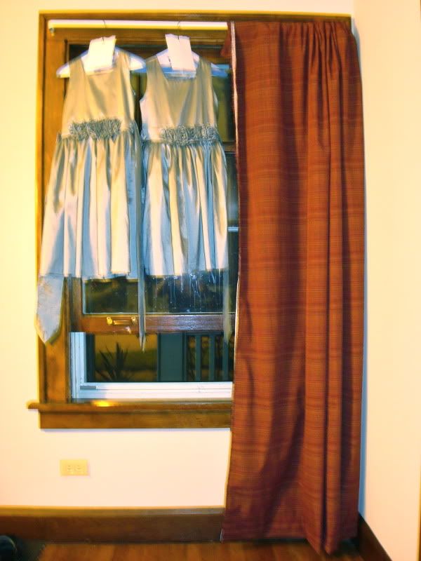
Sidenote: I also hemmed Darren's nieces' flower girl dresses. I won't go into detail, but let's just say I started with this...
And ended up with this terribly blurry and out-of-focus night shot...
So there you have it friends. Pro-craft-ination at its finest. And I promise to have some house updates in the next post!






Post a Comment