1
Apple Of My Pie
I’ve been doing so many projects over the past week or so that I haven’t even had time to write about them! But I wanted to jump in today with a quick post about how I spent my evening last night while Darren was at his pickup basketball game.
The holidays are my favorite time of year, and I’m always looking for ways to prolong all the delicious smells and dishes that seem to go along with the season. This is especially the case for the hellish three and a half months of Cleveland winter that follow, during which time comfort food is the only means of sanity survival. For me, apple pie is one of those comfort foods, along with apple crisp or any other dessert that remotely resembles apple pie and does not come from an aluminum can (which is just gloppy and unacceptable). So, let me tell you how to savor the flavor. Do your own canning. Go ahead and laugh. What is this, the early 1900s? No, friends. It’s 2011, and the economy is crap. So let me teach you how to be resourceful. And lazy. At the same time. I’m blowing your mind right now, I know. Canning may seem like a lot of work on the day you are preparing everything, but it allows you to indulge in cold-weather-laziness for the rest of winter knowing that half the work of a delicious homemade dessert is already done for you. That’s a win in my book. Canned apple pie filling has its obvious use – pie – but can also be used as the base for apple crisp or topping for ice cream, waffles, pancakes, and any other creation you can think of. And, if you were an overzealous apple picker at the fruit farm this year, it’s a great way to use up any extra apples you might be tired of eating without letting them go to waste. Maybe you can even give the jars as cheap but yummy gifts to your pie-loving coworkers. (Spoiler alert if any my coworkers are reading this.) If you’ve read this far, I think you know what I did last summer was doing last night...canning apple pie filling!

Canning is different from regular cooking in that you have to precisely follow a recipe that was specifically created for home canning. Unfortunately, you can’t just take any old recipe and throw it in a ball jar, nor can you just eyeball the ingredients and make modifications to suit your tastes (which is usually my preferred way of cooking). The reason for this is that there are food safety standards you need to adhere to when preserving food. Blah blah , standards, blah blah....Just kidding. It’s important to find a canning-approved recipe in order to avoid the food spoiling, or even worse, getting someone sick from botulism. Don’t get freaked out. Just find a book on home canning, do a Google search for “canned <insert name of food>” or look up your state university food safety extension office which will have all the recipes and guidelines laid out for you. Here’s the apple pie recipe I used, laid out in a nice pie chart, from the Ohio State University Extension Office. Whatever you use will likely be the same, or similar, so I’m just going to give you a little play by play of how it all went down.
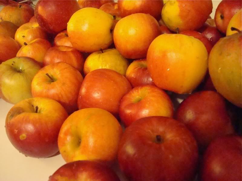
Knowing I would need to move pretty quickly once the apples were prepared, I gathered up all my necessary 'equipment' and washed and dried everything. This included my water bath canner (you can find them at Walmart and most grocery stores starting around late August), 7 quart sized jars with never-before-used lids (the sealing compound needs to be intact so an airtight seal will form), a funnel, a stock pot for the 'syrup,' another pot to blanche the apples, a cutting board, bowl, and if you arelazy lucky, an 'apple machine.' Needless to say, my little kitchen was quite crowded with all this stuff. And don’t forget the apples! I gathered up the two giant bags of apples we picked at the end of September and gave them a good rub scrub down. I think they were a mixture of Cortland and Jona-gold, but I don't remember because it was so long ago. There we a few bad ones I had to throw out, which didn't surprise me because it had been awhile since we picked them.
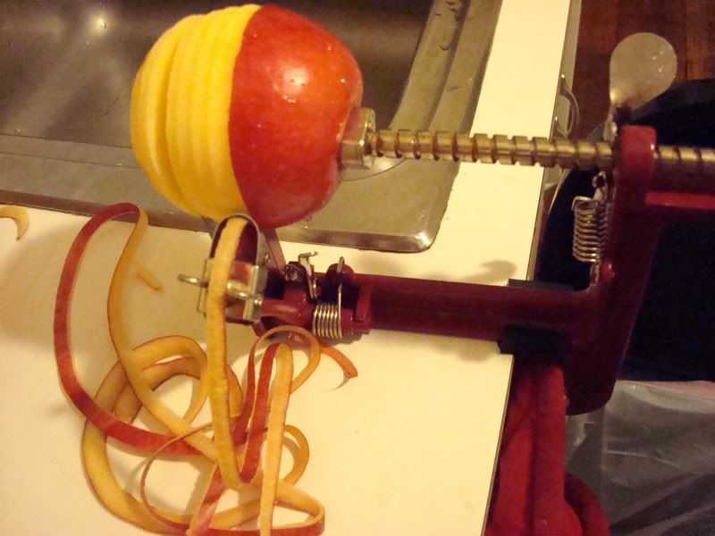
Enter stage right: The Best Kitchen Invention Ever. Action!


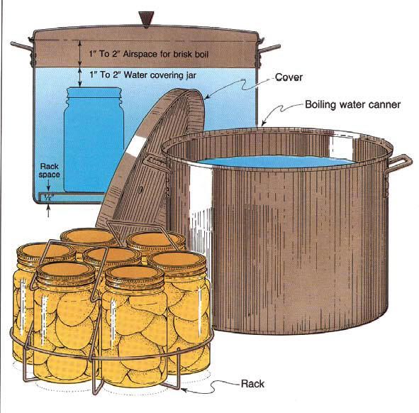
Then I placed the lids on the jars and attached the screw caps. Most water bath canners come with a metal rack that perfectly holds up to 7 quart sized jars.
I put 6 in mine, then used the handles to lower the rack into the pot (which should be at a simmer by now if you started it earlier.) The water should cover the jars by 1 to 2 inches, so if it doesn’t, add a bit more.

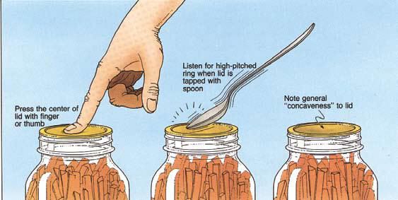
With the water at a boil, I put the lid on the pot and started the processing time according to the recipe – in this case, it was 25 minutes. When the processing time was up, I pulled the hot jars out using a jar grabber (also in the canning tool kit) and set them on a towel to cool. I also checked the lids to make sure they were concave, meaning they have sealed properly.
In the words of Borat - great success!

Knowing I would need to move pretty quickly once the apples were prepared, I gathered up all my necessary 'equipment' and washed and dried everything. This included my water bath canner (you can find them at Walmart and most grocery stores starting around late August), 7 quart sized jars with never-before-used lids (the sealing compound needs to be intact so an airtight seal will form), a funnel, a stock pot for the 'syrup,' another pot to blanche the apples, a cutting board, bowl, and if you are
Enter stage right: The Best Kitchen Invention Ever. Action!
It's an apple corer-peeler-slicer thingy...aka torture device...aka apple machine (I think that's its real name)! Mine was a gift from my mom, but I think you can find them on Amazon. Even if you only make apple pie once a year, you need one of these. It simultaneously peels, cores and slices your apples in a matter of seconds. I think I was able to get through all the apples I needed for my 7 quarts of pie filling within 15 minutes. Ah-mazing. Anyway, before I got carried away with my apple torture device, I started heating a stock pot half full with water in preparation to blanche the apples. I also filled my water bath canner half full with water to start bringing it to a simmer. (I wanted it to be ready ahead of time because as soon as the jars are filled, they need to start processing in the water bath canner immediately.) I cut the apple rings in half and set them aside with a bit of lemon juice until I could get through all of them. Then I blanched them in batches.
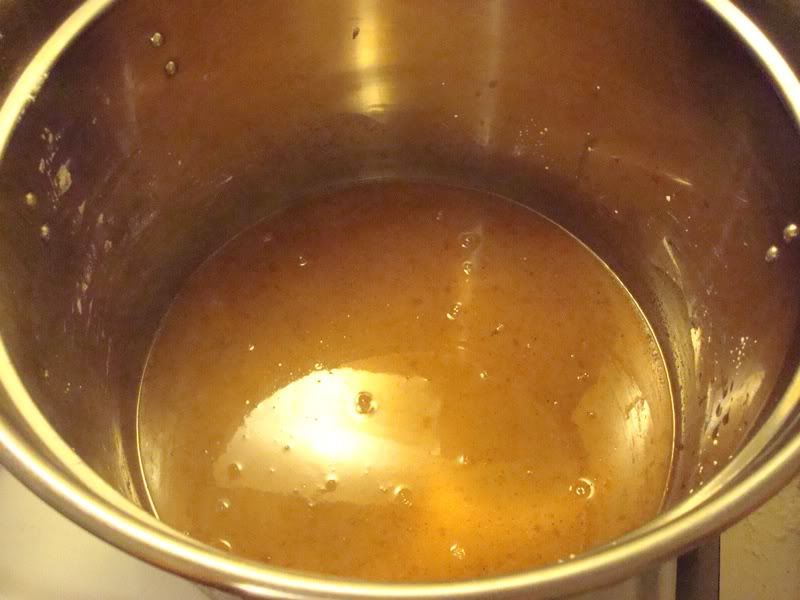
(I promise my apples weren't really a freakish yellow color. I just have terrible lighting in my kitchen, along with yellow painted walls, which tends give all my in-the-kitchen pictures a yellow tint at night.) The already blanched apples stayed warm in a covered bowl while did new batches. When all the apples were ready, I prepared the 'syrup,' which consisted of spices, water, apple juice, sugar and a canning-specific thickening powder called UltraGel. (UltraGel takes the place of cornstarch and also happens to be a pain in the arse to find. Hence the reason I picked apples in September and am just now canning them in November. I ended up ordering it online.) It all went in the pot to bubble and thicken, while I whisked away so nothing would clump or burn on the bottom.
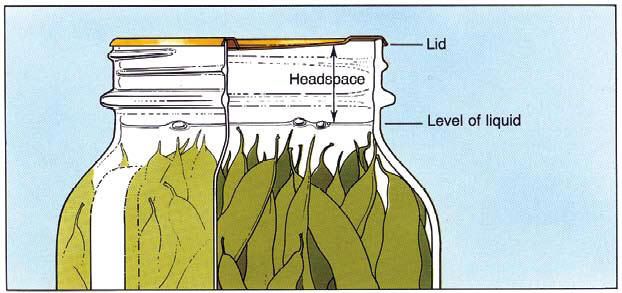
Once everything was nice and thick, I added the apples back in, folding them so they wouldnt break apart while being fully coated by the syrup. Oh boy were things starting to smell delicious. I wish they made scratch-and-sniff computer screens for your benefit. Now that the whole shebang was ready, I spooned the mixture into my quart sized jars, using a wide mouthed funnel and leaving an inch of head space at the top.
 |
| Photo courtesy of www.pickyourown.org |
I found the funnel (along with a magnetic lid grabber and plastic spatula) as part of a canning tool kit when I bought the water bath canner. Not only does the funnel fit perfectly inside the jar, but it reaches exactly an inch down into the jar, which serves as a foolproof guideline for the highest point to which you should fill.
Remove the funnel and take a look at the sides of the jar. You will likely see a few air bubbles, so use a spatula or knife to slowly push along the sides and get rid of them.
Then I placed the lids on the jars and attached the screw caps. Most water bath canners come with a metal rack that perfectly holds up to 7 quart sized jars.
 |
| Photo courtesy of www.pickyourown.org |
 |
| Photo courtesy of www.pickyourown.org |
You might have realized at this point that the recipe makes 7 quarts of pie filling, but I only processed 6 jars. Well, you didn’t expect me to stand around smelling all this deliciousness and not eat any of it, did you!? I mean, how could I give away all this pie filling without even knowing how it tastes? So, I dumped what would’ve been the 7th jar of filling into a small baking dish and whipped up a quick crumble topping. If you needed to be convinced of the convenience of this recipe, it took me about 5 seconds to put the filling in the pan and mix it with a dash of vanilla extract, and only another 5 min to make the crumble topping ( 1/3 C oats, 1/3 C flour, ½ C brown sugar, 6T cold butter, a dash of salt and a dash of cinnamon mixed with a fork until crumbly). I baked it at 400 degrees for 30 minutes – a sweet surprise for Darren when he returned home from basketball.
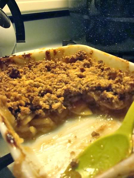
Who am I kidding. It was really just a sweetsurprise treat for me. Wink!
Who am I kidding. It was really just a sweet